


Want to know how much website downtime costs, and the impact it can have on your business?
Find out everything you need to know in our new uptime monitoring whitepaper 2021

In this latest frontend trend of using JavaScript frameworks (e.g. React and Vue) to split out sections of our code into components, design systems have a fantastic role to play.
A design system can be thought of as a cookbook. Each recipe has a picture of the meal (or in our case, a living, interactive example of the component), an ingredients list (maybe sub-components that live within parent components), and finally the instructions (how to implement and tweak with props). In short terms, it serves as documentation for each reusable UI component in your project.
Design systems are incredibly useful when you have a medium to a large-sized project with multiple developers working on it. They help to document components, in order to make understanding and working with them a lot easier. They also can aid your testing coverage, as visual testing frameworks can work in conjunction with them to prevent visual regression.
In this tutorial, I’ll be using one of the most popular frontend tools for building a design system – Storybook. This works really well with React, so I’ll be setting up a React project with an example component and showing you how to integrate Storybook within that. You will need to know a little bit of React to follow along.
Just a small note – I have committed all of the code from this tutorial to a Github repo (just in case you need to refer to it at any point during the steps). You can find it here – https://github.com/alexalala/react-storybook-example.
Create React App is a fantastic way to quickly set up and bootstrap a React project. The setup for this is simple, head to your terminal and `cd` into the folder you’d like your project to live in. You’ll need the latest version of Node on your machine to set this up. In this example, we’re going to name the project react-storybook, but you can change this if you want to. Run these three commands in your terminal to create your project and run it.
| npx create-react-app react-storybookcd react-storybooknpm start |
You should now be able to visit http://localhost:3000/ and see your new React project.
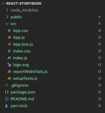
Now that we have our project set up, we’ll need to create a component. Open up your chosen text editor (I’m using VS Code), and the folder structure should look a little something like this:
Within the ‘src’ folder, let’s create a new folder called ‘components’ and then a file within that called ‘Button.js’. Inside Button.js, add the following Javascript code, to construct our fairly simple button component:


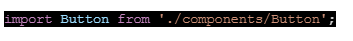
I have also added some inline styles and ‘text’ as a prop. We should now add this into the App.js file to ensure it is all working as expected. First, we’ll clear up the current content on http://localhost:3000/. Open ‘App.js’ and remove everything between <div className=”App”> and it’s corresponding closing </div> tag. We can now also remove the logo import on line 1, as we’re not using this anymore.
Now, we can add our Button component in. On line 2 after the CSS import, let’s import it:
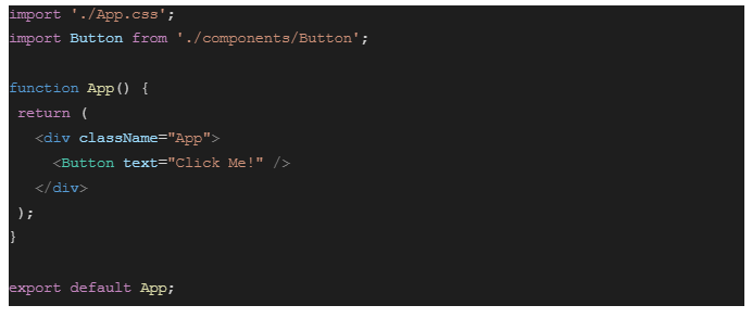
Then, let’s add it into the App component, between <div className=”App”> and its closing tag. We’ll also give it a text attribute with the string “Click Me!”, which will be passed down to the component as a prop:

Your App.js file should now look a little something like this:
You can now head back to http://localhost:3000/, and the app should have hot-reloaded and be showing your “Click Me!” button.
Now that we have a working component in our React project, we should now add Storybook to set up our design system. Head back to your terminal and run the command ctrl+c to stop your server from running. Then add Storybook by running npx sb init.
| npx sb init |
After that has finished, you can run the command yarn storybook to start the storybook server.
| npm run storybook |
This will run on port 6006, so (if it doesn’t automatically open for you), you can view your storybook at http://localhost:6006/.
You should now be able to see the Introduction page with further details on how to configure and learn more about Storybook, but on the left-hand side, you’ll also see a list of elements like a Button, Header, and a Page. These are example stories that Storybook sets up for us to show us how they work. Feel free to have a little play around with them and their ‘stories’ folder in your code editor.
Storybook also has hot-reload enabled, so will update the page on http://localhost:6006/ as soon as you save any changes in your files. You can test this by changing some of the text in src/stories/Introduction.stories.mdx file and then view the changes in your browser.
Now that we have Storybook within our project, we’ll need to start writing stories for our existing components. Earlier on in the tutorial we created a Button.js component, so let’s head over to our text editor and open the src/components folder (where our button file currently lives). We should now create a new file within this folder, named Button.stories.js.
Within Button.stories.js we’ll now need to set up our imports. We should only need React and our Button component, so add the following two lines to the top of the file:

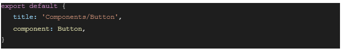
Then we’ll need to create the default export of the file, defining the story title and the component to use:
Finally, we should create the default story:

You can now head back to http://localhost:6006/ and should be able to see a new ‘COMPONENTS’ section in the left-hand column. If you click into this section and then onto ‘Button’, you will see the button component we made in step 2.
As I mentioned before, Storybook is a living style guide. This means that instead of showing an image or still of our component, the component is fully interactive, as it would be on a web page. We can test this by adding an onClick event to our button component.
In your code editor, open your src/components/Button.js file up again and create a new line within the opening <button> tag, above our style declaration. On this new line, we’ll add the following code:

This is setting an alert function, to occur when the button is clicked. So let’s save the file and try it out – open your style guide on the browser and try clicking our button. You should have an alert pop up with the text ‘I’ve been clicked!’.
There are many more powerful things you can configure Storybook to do, for instance using the controls tab to real-time tweak the props you’re passing to your component with a friendly user interface (to improve collaboration with non-technical design teams). You can also create mdx documentation pages – like the introduction page mentioned at the end of Step 3 – which are a great addition to the individual component stories as they are a space for more overarching docs, like typography and colour rules.
In conclusion, the possibilities with Storybook are endless, so I’d highly recommend adding it to your project and exploring what else it has to offer.

3 min read The allure of OpenClaw is undeniable. You deploy a highly autonomous, self-hosted AI agent, give it access to your repositories and inboxes, and watch it reason through complex workflows while you sleep. It is the dream of the ultimate 10x developer tool realized. But as any veteran DevOps engineer will tell you: running an LLM-backed
7 min read There are cloud outages, and then there are us-east-1 outages. That distinction matters because failures in AWS’s Northern Virginia region rarely feel like ordinary regional incidents. They tend instead to expose something larger and more uncomfortable: too much of the modern internet still behaves as though one place is an acceptable concentration point for infrastructure,
7 min read Artificial intelligence is making software easier to produce. That much is already obvious. Code that once took hours to scaffold can now be drafted in minutes. Boilerplate, integration logic, tests, refactors and small internal tools can be generated with startling speed. In some cases, even substantial pieces of implementation can be assembled quickly enough to
10 min read Whilst AI has compressed the visible stages of software delivery; requirements, validation, review and release discipline have not disappeared. They have been pushed into automation, runtime and governance. The real risk is not that the lifecycle is dead, but that organisations start acting as if accountability died with it. There is a now-familiar story about
4 min read How AI Is Shifting Software Engineering’s Primary Constraint For most of the history of software engineering, the primary constraint was production. Code was expensive, skilled engineers were scarce, and shipping features required concentrated human effort. Velocity was limited by how fast people could reason, implement, test, and deploy. That constraint shaped everything from team size,
5 min read Autonomous Code, Trust Boundaries, and Why Governance Now Matters More Than Ever In Part 1, we looked at how AI has reduced the cost of building monitoring tools. Then in Part 2, we explored the operational and economic burden of owning them. Now we need to talk about something deeper. Because the real shift isn’t